Client: Propostion pour Jardiland
Projet: Refonte d'identité de marque

UNE HISTOIRE DE JARDINAGE
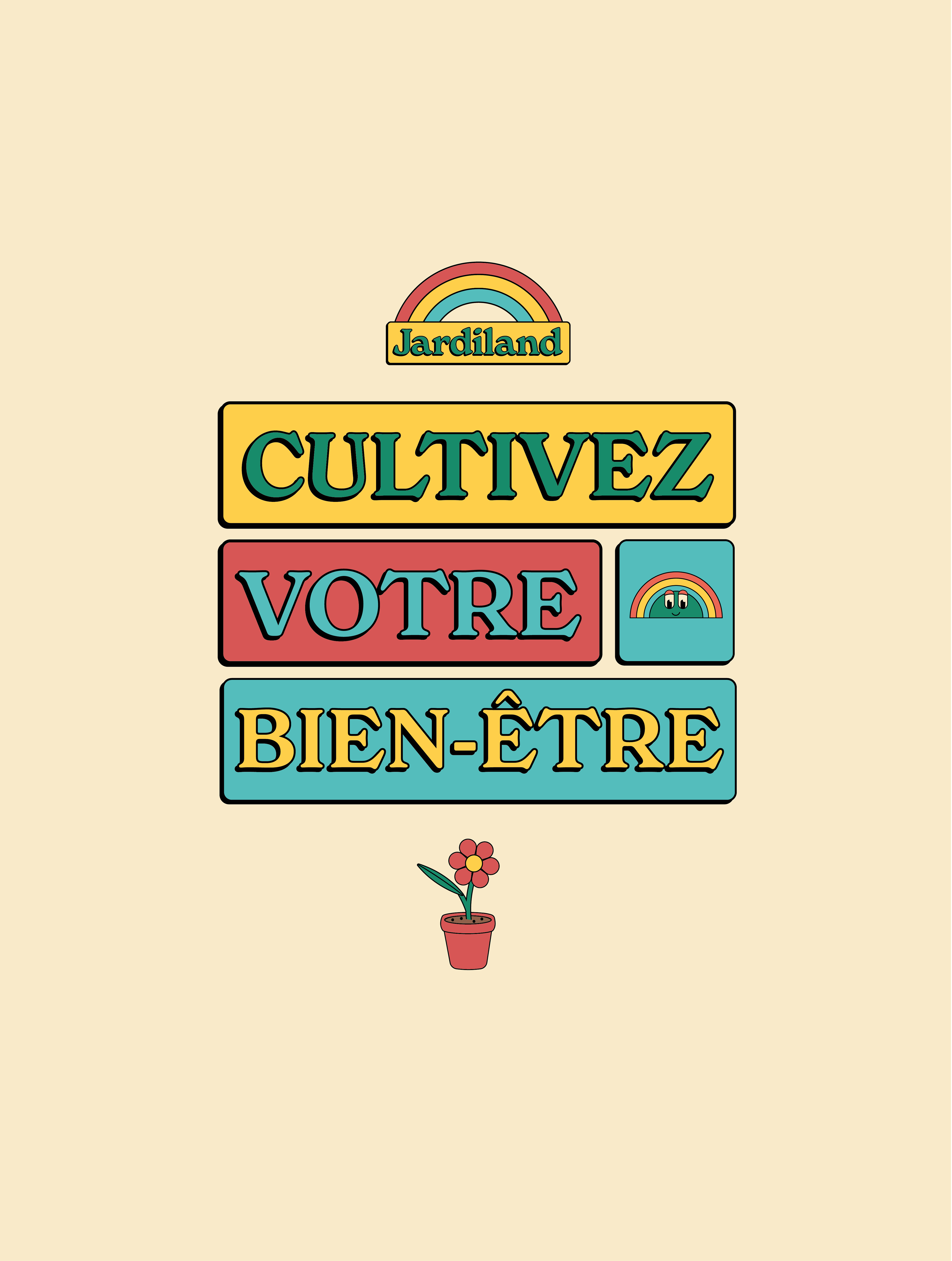
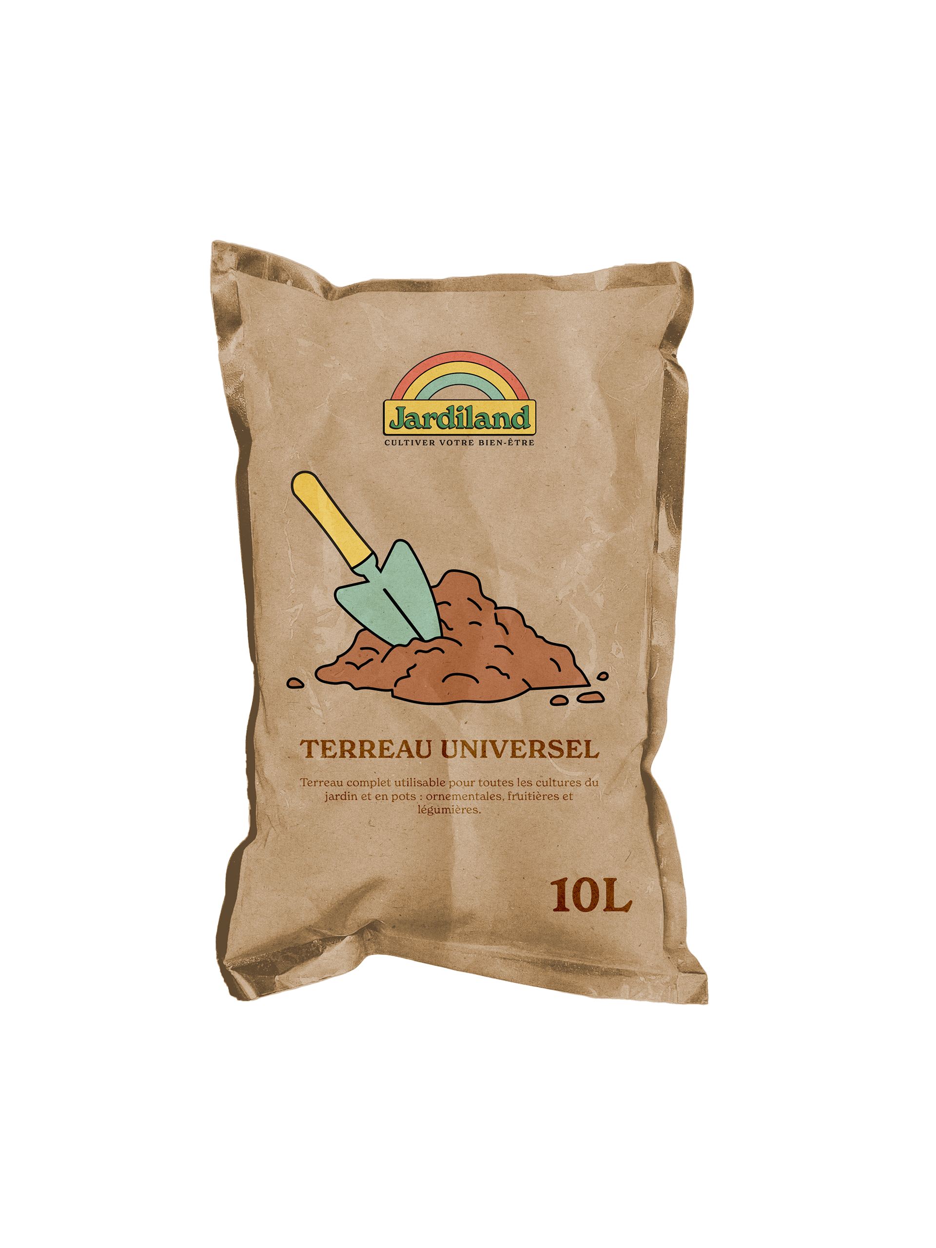
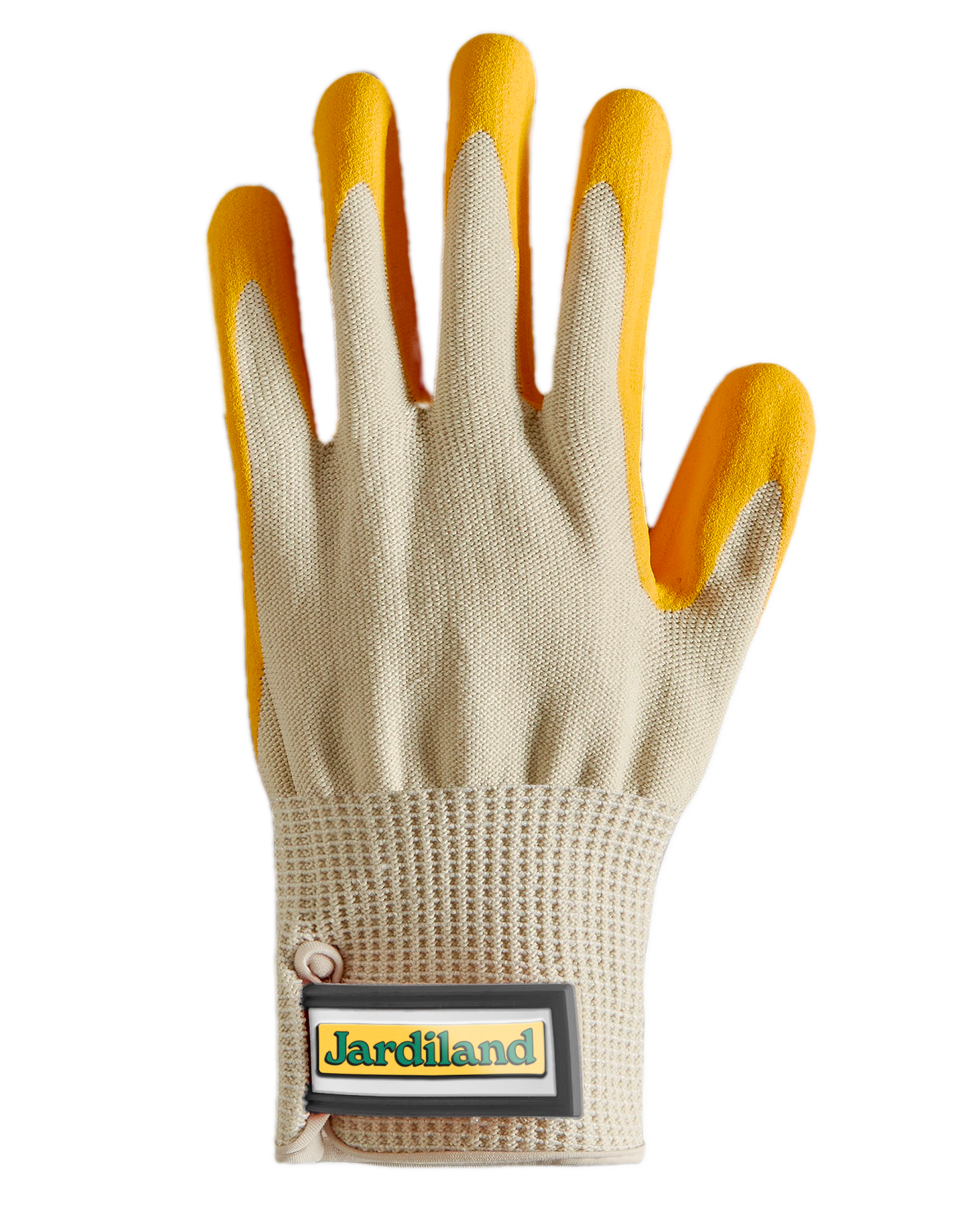
La proposition de refonte de jardiland a pour but de donner à la marque une identité renouvelée tout en restant fidèle à son adn historique. Pour cela, inspiré du mouvement flower power des années 60, le symbole de l’arc-en-ciel a été utilisé comme image clé du logo qui accompagne le logotype avec une touche rétro.
L’idée était de moderniser leurs premiers logos tout en gardant à l’esprit que la marque veut faire avancer les concepts de nature et d’écologie. De plus, pour plaire à une cible plus jeune, la nouvelle identité serait plus colorée et ludique. Pour accompagner ces concepts, des icônes et des mascottes ont été créées.
La palette de couleurs est variée et rappelle les couleurs de la nature avec des tons chaleureux. Les illustrations ont un style géométrique et des contours noirs pour un style fait main. Tout au long de la nouvelle identité, des grilles massonry sont utilisées pour organiser les informations clés ainsi que les illustrations, cela rappelle les parcelles de potagers dans un jardin.
//A GARDENING STORY
The proposal to redesign Jardiland aims to give the brand a renewed identity while staying true to its historical DNA. Inspired by the flower power movement of the 1960s, the rainbow symbol has been used as the key image of the logo accompanying the logotype with a retro touch.
The idea was to modernize their early logos while keeping in mind that the brand wants to put forward the concepts of nature and ecology. Additionally, to appeal to a younger audience, the new identity would be more colorful and playful. To complement these concepts, icons and mascots were created. Throughout the new identity, masonry grids are used to organize key information as well as illustrations, reminiscent of vegetable garden plots.